KINGS
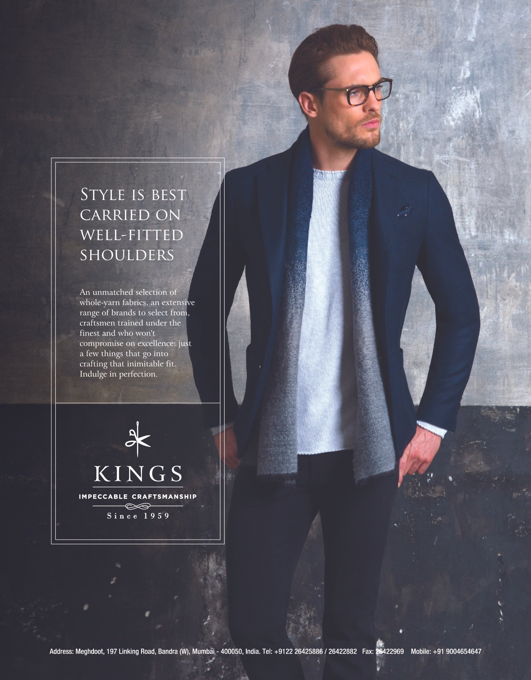
KINGS Store has been around since 1959, they have the finest and the biggest collection of the best fabrics. The quality of their fitting and stitching is at par with the best suit makers around the world, which most of their customers will vouch for.
They wanted a new and modern look for their brand, which gives them a good market position and help them connect with the new-age buyer.
Industry: Fashiom
Services: Branding
Role: Concept and Design
SELECTED CONCEPT
Here the illustration for the symbol is derived from using the elements of tailoring- scissors and needles. The form of the scissor forms the letter K, in a subtle way. The added details of flourishes, emphasises on the craftsmanship and detailed work in Kings clothing.


OTHER CONCEPTS
When you hear the word King, the first few symbols and connotations that come to your mind are a Human King /emperor, Lion, Palace, Castle, Army, larger than life. The Lion is the King of the animals, it is the strongest in the animal kingdom. The lion connotes leadership.
The fabrics used; if you see them minutely have an interesting design in their weave and texture. These design patterns have been used in the logo to show their precision and details.


The art of modern-day tailoring suits has been handed down from the British in India. The best bespoke tailoring shops are based in London. Even the Craftsmen from kings have been trained under British tutelage.
So here the elements /symbols that form the backbone of this identity are, instruments of tailoring, shields, swords, British flag, etc. The Elements are combined interestingly and discreetly, to connote the British lineage at the same time give a feel of heritage and legacy in contemporary way.

